Light renders art visible in museums. At the same time though light also interprets. In this regard curators, architects and artists often have differing expectations about how art should be appropriately displayed. This article is based on the aesthetics of image and exhibition and presents six categories of display – ranging from the objective reception of art to hyperrealism and the dynamic mediation of art treasures.
Each method of museum lighting serves to communicate a conceptionally based approach to art. Architects demand an acknowledgement of the building itself, curators aim to make a contextual statement about the collection as a whole, collectors as lenders are keen to communicate a particular sense of aesthetics and the artists themselves insist on the suitable display of their individual works.
1. The pretense of objective art appreciation
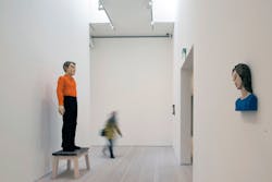
The sober, empty, white-walled rooms of exhibitions evoke the impression of a factual and objective method of displaying art. Large-format paintings such as works from the American Color Field movement from the 1950's have a particularly positive impact in galleries often termed "white cubes" because the wall becomes an extension of the artwork itself.
Any attempt to emphasize the special features of an individual artwork within such neutrally displayed exhibitions is neglected in favor of a uniform presentation of the exhibits. Visitors experience a spatial impact even in completely neutral presentations of art – the brightly lit, peripheral white surfaces attract the eye of exhibition visitors. The artwork as a darker object is able to break away from the bright background and therefore blends visually into the foreground.
2. Minimalist accenting – subtly emphasizing works of art and motifs
To disassociate from the uniformity of the "white cube" concept without taking on a more theatrical form of presentation, an approach has developed that works with bright surroundings but subtly emphasizes individual works or conceptional motifs. In this regard two varying strategies are used: firstly with the background that differentiates itself from the artworks via the brightness and color tone of its wall color, and secondly the use of discreet accent lighting. With dark wall colors, the paintings often seem brighter on their own due to the contrast in brightness compared to displaying them on white walls. Another variant consists in the use of color contrasts, where for example paintings with warm color tones are displayed on walls with cool colors. This effect can be highlighted with supplementary accent lighting. In the world of art, subtle differences in brightness are found for example in the Renaissance with Sandro Botticelli.
3. Strong contrasts in light achieve dramatic presentations
Both painters and photographers take advantage of intensive contrasts in light and shadow to achieve a sense of tension in their image compositions. The Chiaroscuro style developed in the Late Renaissance and Baroque eras typical for example of many works by Caravaggio or Rembrandt attempted to achieve dramatic image effects.
If this approach is transferred to an exhibition room the artwork becomes the center of attention and the peripheral space recedes to disappear into the surrounding darkness. The intensive contrast in brightness establishes a dramatic atmosphere for visitors, exerting a sense of fascination akin to a stage performance. Curators must ask themselves how far they can go in emotionalizing the apparently objective visual language of the artist in an attempt to achieve high-profile exhibitions.
4. The black box: magically illuminating works of art
Very dark exhibition spaces seem to exude a secretive atmosphere where works of art arouse in observers the impression of being illuminated from within. The concept of a black box where exhibited objects are illuminated as jewels in a form of treasure box represents the opposite approach to the white box. The Canadian artist Jeff Wall for example shows his photographs in illuminated boxes, and this involuntarily arouses associations with the cinema, television and luminous advertising.
If artworks seem to only illuminate from within, they disassociate themselves completely from their architectural surroundings. This approach creates an artificial context because artists seldom create their works in comparable conditions, and luminous surfaces in this form do not occur in nature. Contour spotlights are indispensable for such effects because they have a framing attachment.
5. Interpreting artworks with hyperrealism
Visitors are confronted with an exaggerated sense of reality within hyperrealistic display strategies. The contemporary British artist Matthew Penn classifies his works as belonging to hyperrealism. The artist emphasizes gradations of brightness in his portraits with use of lighting to achieve greater clarity and a stronger, more subtle definition of details.
Artworks subjected to hyperrealistic display situations are intentionally exposed to transformations that aim to increase visual perception, often to an excessive extent. Curators are faced with the question of how far they can proceed to contributing to a new method of experiencing art using hyperrealism, in the striving for exhibition success achieved by reinterpreting the exhibits. With hyperrealistic exhibition concepts, lighting designers experiment with special brightness distributions or the light spectrum itself for example.
6. Dynamically communicating exhibitions
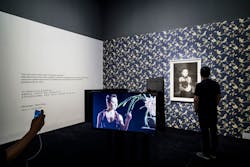
Visitors equipped with tablets and mobile phones already have their own interfaces to access further information, to discover exhibits in a playful way using apps and augmented reality and to even interactively influence presentations. Modern technology has much simplified the implementation of dynamic display concepts and also enabled new forms and methods. Peggy Guggenheim used dynamic light in her first New York gallery "The Art of This Century" in 1940 with the intention of creating a new method of access to art, and visually communicating the pulsating character of life by using pulsating light. Artworks as singular static objects disappear, to be replaced by dynamic backdrops for high-impact and informative overall experiences.
Check list
- Close agreement and coordination with the curator and artists in the preparation phase help to minimize any corrections when setting up.
- Criteria such as the size and brightness of the exhibit, frame type, image content and light conditions at the time of creating the image help to evaluate whether a lighting solution would look natural or whether it might hinder the artistic reception.
- Multiple lighting solutions need a flexible infrastructure, e.g. tracks with spotlights.
- Replaceable light distributions enable quick and convenient modifying of the lighting concept from wallwashing with a neutral impression to more dramatic accent lighting.
- Dimmable spotlights are indispensable in achieving dramatic effects using differentiated contrasts between the exhibit and the room.
- Contour spotlights are a good solution for 'magical' presentations where the light beam is precisely limited to the edges of the picture.
Author
Dr. Thomas Schielke studied architecture at the Darmstadt Technical University, Germany. He has worked for more than ten years as editor for didactic communication at the luminaire manufacturer ERCO and is the co-author of the textbook "Light Perspectives: Between Culture and Technology".
Uniform distribution of brightness in the room and almost shadow-free artworks give the Forsblom Gallery in Helsinki a neutral and unemotional atmosphere. Architecture: Gluckman Mayner Architects, New York. Image: © ERCO GmbH, www.erco.com, photography: Thomas Mayer
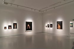
Various beam distributions enable exhibition organizers to individually emphasize exhibits. Museum Gugging, Maria Gugging. Image: © ERCO GmbH, www.erco.com, photography: Gustavo Allidi Bernasconi
The effect of stringent linear arrangements with artworks can be perfectly emphasized with contour spotlights – these limit the light beam to the picture surface, leaving the surrounding wall in shadow. Arario Museum Dongmun, Jeju. Image: © ERCO GmbH, www.erco.com. photography: Sebastian Mayer
About ERCO
The ERCO Light Factory in the German town of Lüdenscheid is a leading international specialist in architectural lighting using LED technology. The family business, founded in 1934, now operates as a global player with independent sales organizations and partners in 55 countries worldwide. Since 2015 ERCO’s portfolio has been 100% LED. With this in mind, ERCO in Lüdenscheid develops, designs and produces digital luminaires with focus on photometrics, electronics and design. Working closely with architects, lighting designers and engineers, ERCO develops lighting tools used primarily for applications in the following fields: Work, Shop, Culture, Community, Hospitality, Living, Public and Contemplation. ERCO understands digital light as the fourth dimension of architecture – providing highly precise and efficient lighting solutions to support creative designers in turning their visions into reality.


